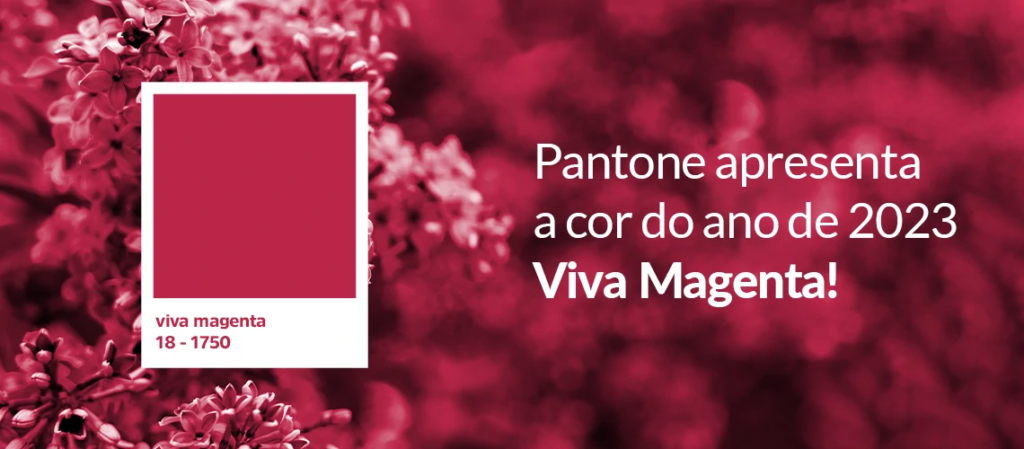
Viva Magenta is the color of 2023. But how did Pantone come up with the shade?
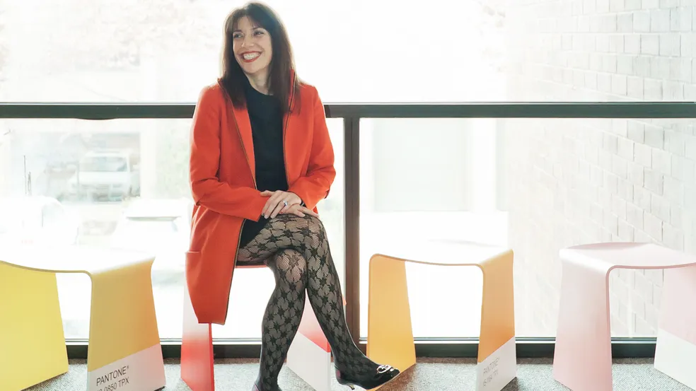
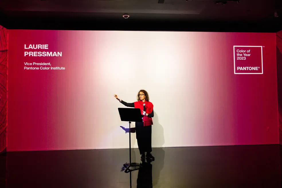
This year, Pantone has chosen Viva Magenta as the standout color of 2023. Laurie Pressman, vice president of the Pantone Color Institute, explains that the choice of the shade involved relevant themes in our society, such as technology, fashion, and politics, as well as being based on a desire to celebrate courage and optimism after a challenging period we have experienced in isolation.
Viva Magenta descends from reds and was inspired by cochineal red, one of the strongest and brightest dyes used in the world.
Warmth of the natural world. Hormones of expression. Possibilities of the digital space. These were some of the themes in the journey of choosing PANTONE color 18-1750 Viva Magenta.
“We are living in an unconventional time. In fact, I have said that the only thing that has been conventional in these times is unconventionality, and during these last few years a lot of things have happened,” says Laurie.
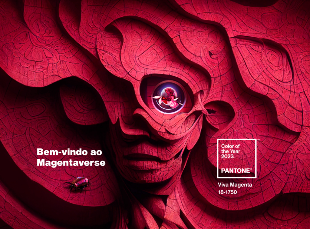
The highlighted hue comes to set the trend of reddish tones in the decoration segment.
Pantone justifies the choice of color by relying also on its bold, fearless and pulsating characteristics that highlight the celebration, joy and optimism.
Explore the complementary colors too, from the “Ignite” palette:
Every year, along with the announcement of the Color of the Year, a palette of complementary colors is usually presented, and in 2023 it was no different. In the new complementary palette are shades that converse with the nuances of the highlight color, allowing the combination of other shades in different uses.
For this year, Pantone has defined a palette called “Ignite”, a mixture of grays and reddish tones, matching Viva Magenta. Below you can see the released palette:
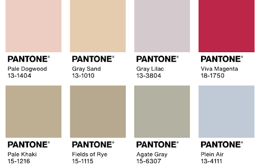
In decoration and fashion, these secondary colors are widely used to harmonize elements, whether in painting and decorative objects, or in the mix of fabrics for making a piece, respectively.
How to apply the color Viva Magenta in architecture and decoration
In the decoration of your home, the use of colors can take place on different occasions. But it is worth noting that, to get into the trend, you do not need to use the exact tone in some decorative elements, just make compositions in similar tones that refer to the Color of the Year 2023. Check out some indications:
On the wall
The great option for those who already want to get into the new color trend is to assign the tone in the space by painting the walls or by using coatings in these shades.
In the case of painting, the tip is to apply the magenta shade on one wall. This will create a highlight in the environment, drawing attention to the stronger shade.
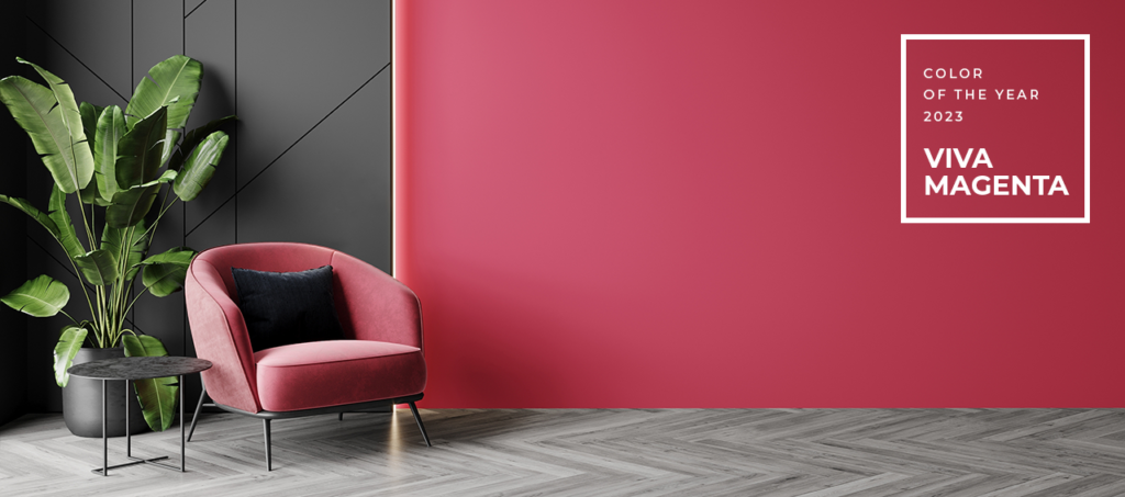
Another tip that is on the rise is to apply paint on half a wall. This will create a division in the room, but in a complementary way with colors from the palette.
With decorative accessories
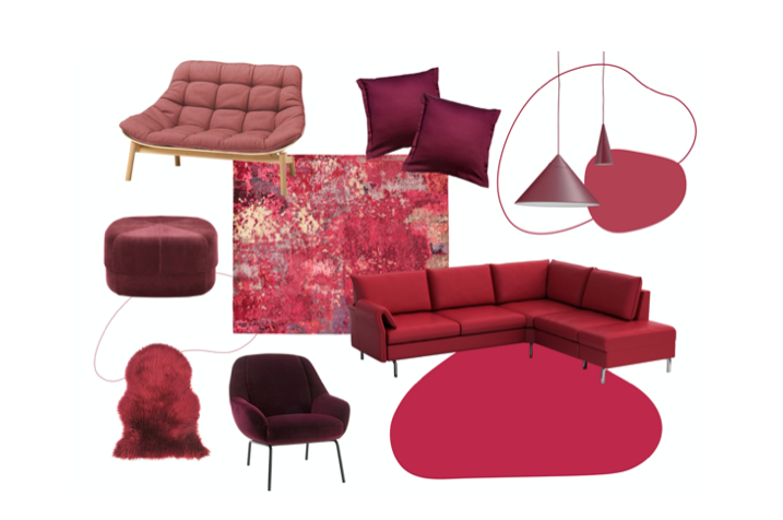
Small decorative objects can bring color and transform spaces where the application of color in large areas is not feasible, or would not look so nice.
In focal points
Another option is to use larger pieces following the highlighted tones for 2023. Here it is worth composing the environment with some item that follows the trend, such as furniture, for example, to complement the decoration.
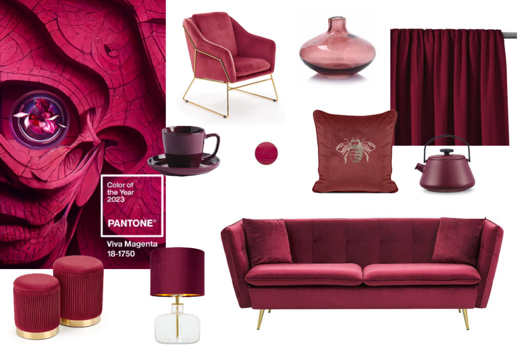
For an uncomplicated décor, Viva Magenta can be combined with a neutral color palette such as gray, white, and beige. Another excellent option is to combine the color with other shades of red and pink.
Who would have thought that playing with colors could create such sophisticated spaces?
Discover with Objective USA how interior design can make a difference by combining modern and timeless decor trends and a unique touch building your home with a look that is influenced and led by you, our client.
We have over 25 years of experience providing timeless, long-lasting design solutions for a variety of tastes and lifestyles. Feel free to contact us and get to know more about our services.


